11:45 p.m.
(h)
Above looks like a f***ing swastika haha
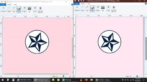
I corrected it. It is because red represents areas that are removed or cut out from the original.
Originally, I did not notice the bottom of the circle was missing -- so, I had to refine cut out, remove it.
I have shared this side by side.
It is barely noticeable. The one on the left is correct, i also changed the shade of pink to a lighter shade.
This contrasts with the slightly darker shade of pink used on the mobile browser tab.
Beautiful, I like the contrast, I love how the blue really works well with the pink -- artist's curse
I love pink and blue