8:30 p.m.
(b)
This is much better.
More white/ blank space = less stress.
The user, he or she suffers micro trauma, when he or she is reading through our website --
the less info, the less stress, the more successful we will be because the user will be happy
Even in this case, I could remove the logo, but I keep it just to help the user
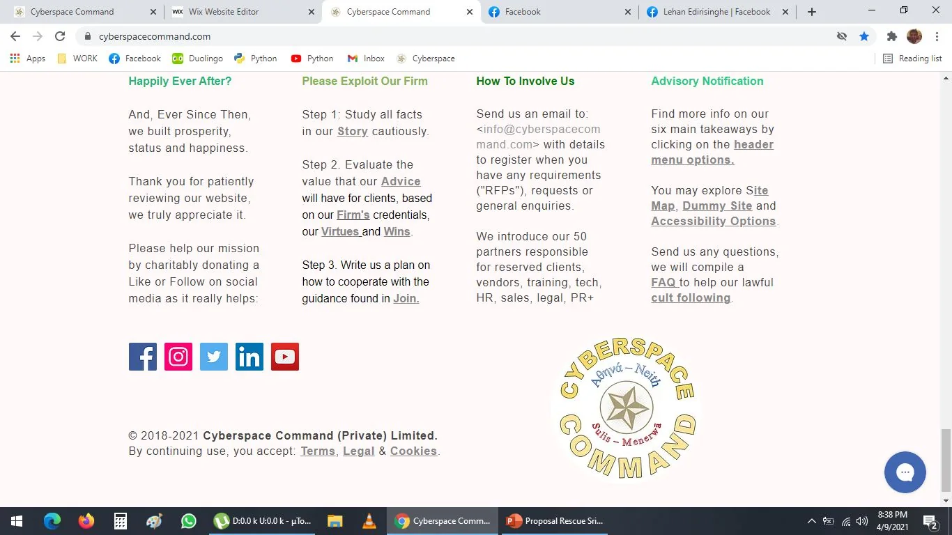
The golden pentagram/ pentacle is first thing user sees, and it is last thing on site
The logo might be like 50 kb, it is not a big deal