9:15 a.m.
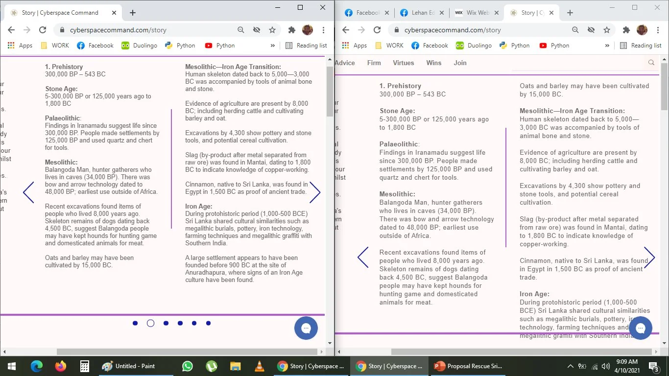
The window on left side is same text as window on the right hand side:
The left text, has 0 character spacing (the leading^? or corning^? between characters) and has 1.2 line spacing it looks like automatically--
The right text has 0.05 character/ text spacing and an optimal 1.4 line spacing 140%, which is more legible --
It is easier to read the one on the right
I am reluctant to add images/ pictures, because it can really cause a slow down in loading times.
I dunno, I will think about it, I might add a few--
Even if these pages take longer to load, the initial welcome/ home page is easier to read through
It loads a lot faster--
I can later augment/ boost with better hosting solutions and services to make it faster