Singapore map, Sri Lanka vote

March 19, 2023 Lehan Edirisinghe

Saw a Singapore election map and pictured Sri Lanka’s 2025 results looking just as sharply divided. The color blocks felt like a preview of coming factions
Story

Rating a Slow Movie Six Out of Ten

9:00 p.m. (j)

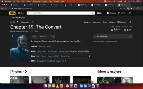
I think this was 6 / 10. Because it was so slow, I actually, for the first time, I was like tuning out or not even watching cause it sucks so bad

It sucks Jabba the Hutt's █████

The image displays a color-coded map illustrating election results across different regions of Singapore. Each area is shaded according to the percentage of votes received by different parties, indicated by a legend. The parties denoted include PAP (People's Action Party), SPA (Singapore People's Alliance), UMNO (United Malays National Organization), and IND (Independent candidates). The map uses different shades of blue, purple, red, and gray to represent varying vote shares, ranging from over 30% to over 70%.
The main map is accompanied by an inset showing a magnified view of a specific area, likely for clarity in regions with more complex divisions. The color gradient helps visualize how each party performed in different districts. The overall design is clear, with sharp lines defining regional boundaries, ensuring distinct separation between electoral results. This map provides a visual summary of voting outcomes, offering a clear snapshot of political support across the nation.

Predicting Sri Lanka’s 2025 Election

10:15 p.m.

This is what Sri Lanka's 2025 election's going to look like.