Making the Site Simpler and Hiding Easter Eggs in the Art
April 9, 2021 Lehan Edirisinghe
A design-heavy page about making the website beautiful through white space, smaller sections, better image loading, and less visual stress. The most revealing move is playful: hiding invisible Easter eggs inside the artwork while imagining a bigger 'Before Lehan' and 'With Lehan' story for Sri Lanka.
Using the Captain’s Log to Study California Readers
5:45 p.m.
(b)
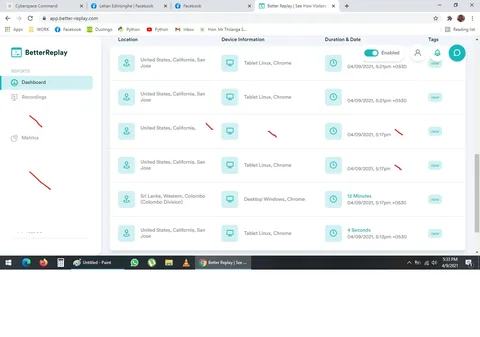
If you consider it, if I put my Captain's Log on our website, I can see who, how long and what people are interested in reading -- and even how they react.
This is interesting -- a LOT of visitors from California!
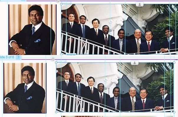
Comparing Reset Website Images
6:00 p.m.
(c)
I had to manually make sure images are loaded properly, it is hard to see these.
But try to see if you can spot the differences?
The images on the bottom are reset images, from our online database, they are slightly better.

Sri Lanka Before Lehan and the Exchange Rate
7:00 p.m.
Story of Sri Lanka
Before Lehan ("BL")
Now it is $1 = Rs 200 LKR
Soon, it will be "With Lehan"
I cannot write After Lehan because I use Anno Lucis
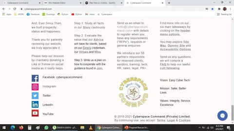
Removing Clutter From the Website Corner
8:30 p.m.
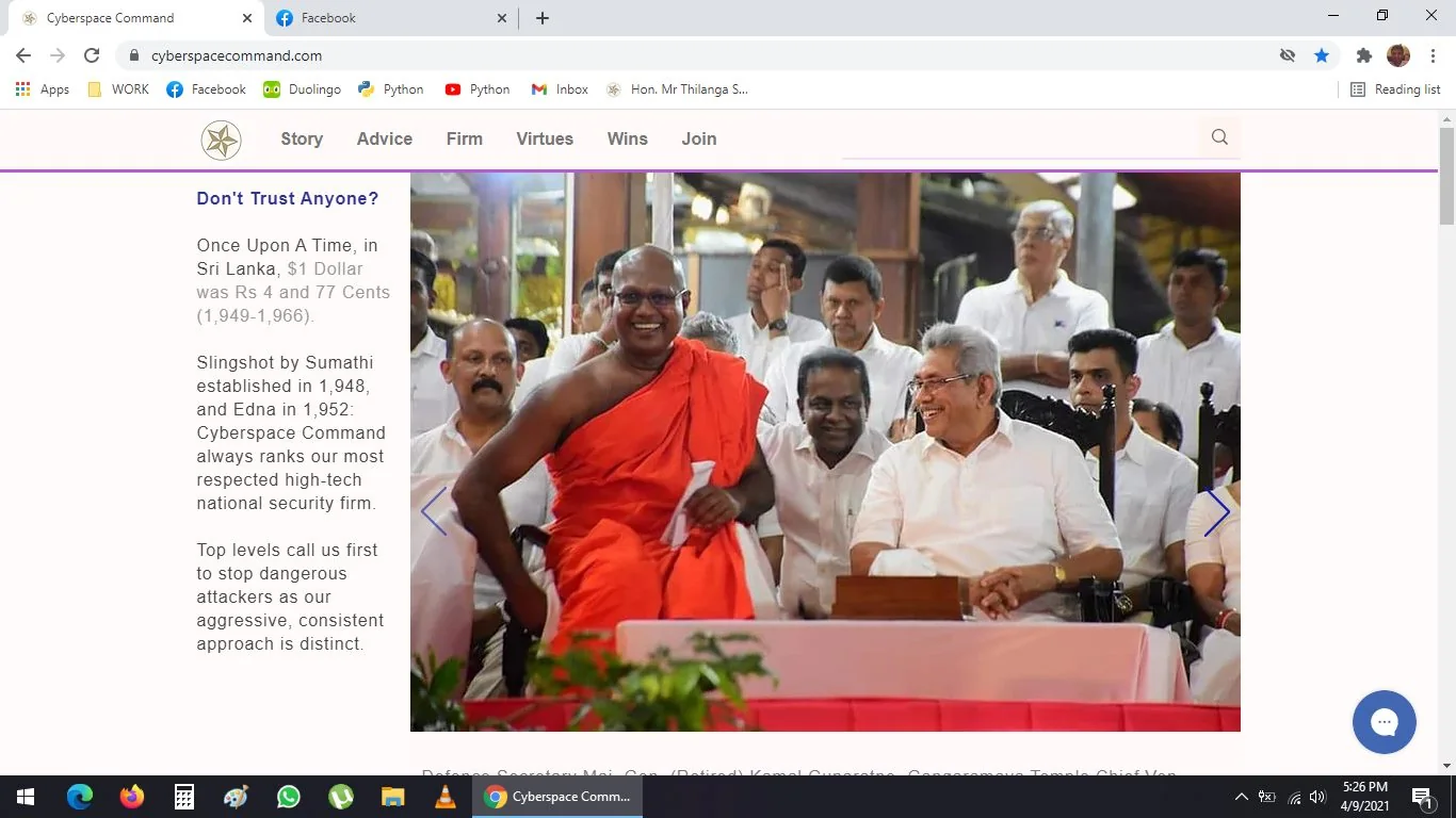
In this screenshot, I elected to remove the unnecessary stuff on the right hand corner.
No need logo, vision, mission, values, and we do not need even need to name social media sites
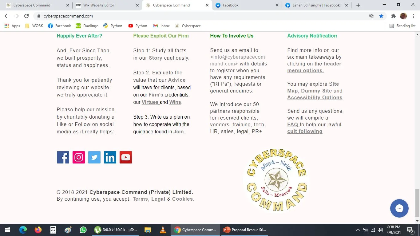
Using White Space to Reduce Reader Stress
8:30 p.m.
(b)
This is much better.
More white/ blank space = less stress.
The user, he or she suffers micro trauma, when he or she is reading through our website --
the less info, the less stress, the more successful we will be because the user will be happy
Even in this case, I could remove the logo, but I keep it just to help the user
The golden pentagram/ pentacle is first thing user sees, and it is last thing on site
The logo might be like 50 kb, it is not a big deal
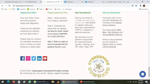
Planning a Simplified “Silly Edition”
8:45 p.m.
Made a few very miniscule improvements:
I would like a Dumbed Down Version called our Silly Edition for very stupid people such as myself--
I like it when info is made easy to understand.
Hidden Symbols in Grandma’s Painting and a Website Easter Egg
9:00 p.m.
I love to do this.
I put so many hidden stuff in my grandma's painting:
i. The 666 sign on her forehead as she has a scar
ii. I put a stupa or Buddhist temple building around her head, in the shape of a Prabhashvara/ Buddha's light aura to wish her on her journey to Nirvana
iii. The Kandyan Blue saree has deep meanings
iv. I made her a few shades whiter
v. I did some other things, I cannot remember
vi. Dharma Chakra gold pendant necklace
vii. Number of lines on her chair was intentional
***
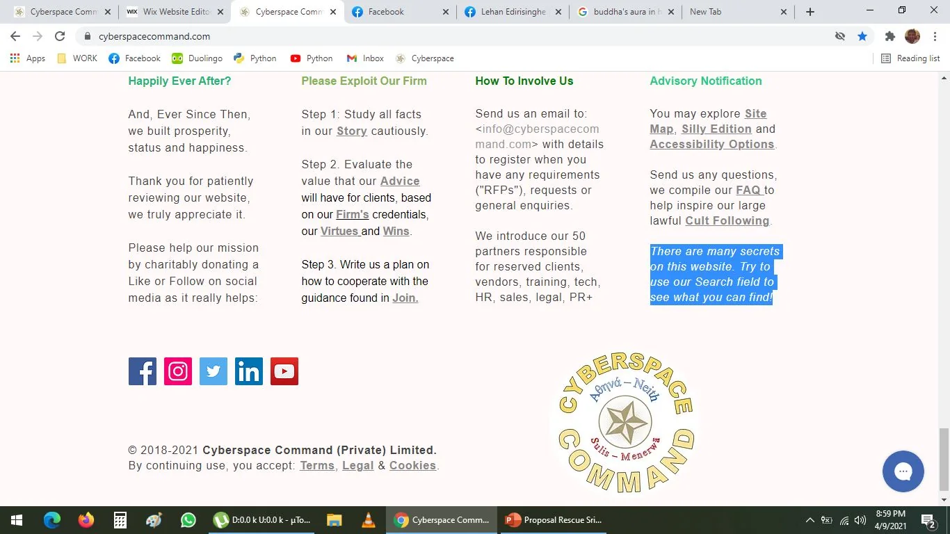
In our website, I added this Easter Egg:
Soo cool!
This is not visible, it is the Snow White white colour, so it is not visible, but if you select it, you see it
Names on this page
1 matched name linked to the Names index.